Business optimization portal
By Roïc Thomas

Data visualization tools
There are many data visualization tools on the market but are they perfectly addapted to your business?
I think that most of them are not.
If you want to use the full power of your data, either from your datawarehouse or from your operating systems, you need to have perfectly adapted visualization tools.
Therefore, I decided to invest time to develop some pilots in order to demonstrate the power of vizualization when it is associated to the right data sources.
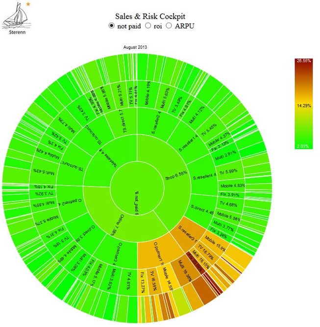
Below is an example of a "sales cockpit" dedicated to risk management in the sales activities.
Every sector in the sunburst diagram illustrates the financial risk performance of a specific segment.
The size of the sector represents the volume of sales in the considered time period.
The color represents the performance in this segment. (in the example, share of not paid invoice amounts)
The sales are segmented in sales channel (online, telesales, shop), channel details (reseller, direct shop, partner shop, ...), product familly (TV, Mobile, Fix, Multi) and product price class (mini, medium, large, X-large).
The product price class is not visible on this level but can be called by diving in a lower segment.
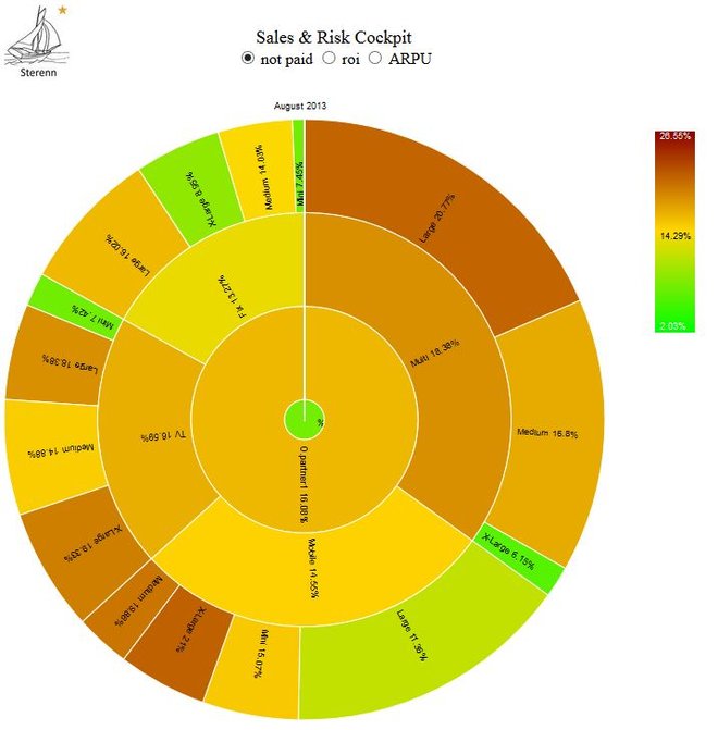
The second sunburst represents the result of a dive-in action on the segment: Online, O.partner1.
This action is simply called by clicking on the segment.
The KPI explorer solution is fullly customizable, transportable, shareable and doesn't require any IT installlation.
We deliver a set of HTML and data files. You are free to use them as you want.